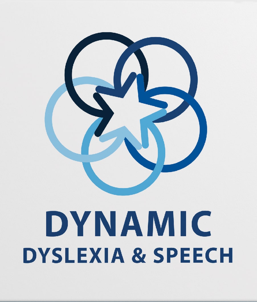
In my initial meeting with Dynamic Dyslexia and Speech owner, Jaimee Fisher, she explained to me that red is a negative color for people with dyslexia because of all the red mistake marks they receive on school papers. When I was brainstorming for the logo, I thought, "What is the opposite of a red X? A gold star!" Jaimee also wanted the logo to have movement, so I designed the arrows to revolve around the star representing moving towards that goal star achievement. We continued to work together on brochures, business cards and a website. To see the full website, visit www.dynamicdyslexiaandspeech.com!
Adobe Illustrator, Adobe InDesign, Adobe XD, Bootstrap, Atom, Github, Wordpress, UserTesting.com
To create a brand that was positive and inviting to parents and children dyslexic or not. Design needed to be organized and easy to follow for dyslexic users. Usability was highly considered through the design process.